(7/10) Finalizing designs and mass-illustrations of everything
What did I do this week
Finalized card illustration style
Finalized cards style design
Planned out card illustrations
Started illustrated assets for my zine
Added more details to my dissertation outline
Review, Edit, Storybook Zine Content
Finalized card illustration style
Left to right: full color style, negative drawing style, and line drawing style
With the border styles finished last week, I focused on determining the illustration style for the cards. My plan was that once I have finalized the design that will surround everything, the illustration part will be much easier. I won’t have to worry about anything and would be able to just crank the illustrations out in that style in a mass-production way without having to worry.
Prior to starting illustrations, I did a little research into Chinese design and illustration motifs and styles. I found this to be super information of what makes a piece of visual art “Chinese” and how I might use that style in my own way, but also have it be grounded in Chinese tradition. The three books I used here:
Porcelain as Expression by Wing On Wo & Co and Gentle Oriental
Chinese Motifs in Contemporary Design by SendPoints
Chinese Art: A Guide to Motifs and Visual Imagery by Patricia Bjaaland
I came up with 3 styles: full color, negative drawing, and line drawing. Full color had multiple colors with shading and is based on inspirational images I found of Chinese porcelain and ads. Negative drawing is based on Chinese paper cutting traditions, where an image is created from a sheet of paper by cutting out spaces in the illustration. The last in a line drawing with a digital brush tip to be a reminiscence of Chinese calligraphy drawings.
After showing my illustrations to a few people for feedback, I decided to move forward with the 2nd (negative drawing) design. It was the one people liked the best, said was most identifiable as “Chinese”, and also the easiest one to mass produce.
Finalized cards style design

Thus, with the illustration style completed, the style for the card design was finalized. The card will be surrounded by a border of a different Chinese motif and color. This was done purposely so that the card categories are identifying even with color blindness.
In the center will be an illustration of the item / ritual in questions. This will be done in the negative space drawing style based on Chinese paper cutting tradition.
Under the drawing will be the name of the item / ritual along with its Chinese character (which I will need to get proofread before I print). Underneath will be the meaning of the item / ritual (if it has one). Underneath that, there will be a short description of what it is and what it represents.
The back of the card will have a unifying design that I have yet to design. I am also thinking of adding a QR code on the back so that you can scan and read more, but I haven’t decided on that yet.
With the card, I really hope that it can be used as a tool for passive learning of CNY. That, combined with the zine, will allow party goers to learn more about CNY and also are prompts to get them to start reflecting on their own family and cultural experiences.
Planned out card illustrations

Using Notion, I planned out the things I wanted to illustrate on my cards. I put the card categories at the top and color-coded them to the border colors I currently have for them. In the table below, I listed out the things I wanted to illustrate, tagged them with the correct category so that I know what color I would need to use, the meaning of the item (if it had one), and my short blurb. I created a page within each item that had a longer history/description of each item that I could use in my resource page for the card later if I have time to do that.
Added more details to my dissertation outline
Once the outline was given to us on Monday, I spent Wednesday afternoon filling out my current draft with the details provided to us. This will help me to write the dissertation in more manageable chunks.
Review, Edit, Storybook Zine Content
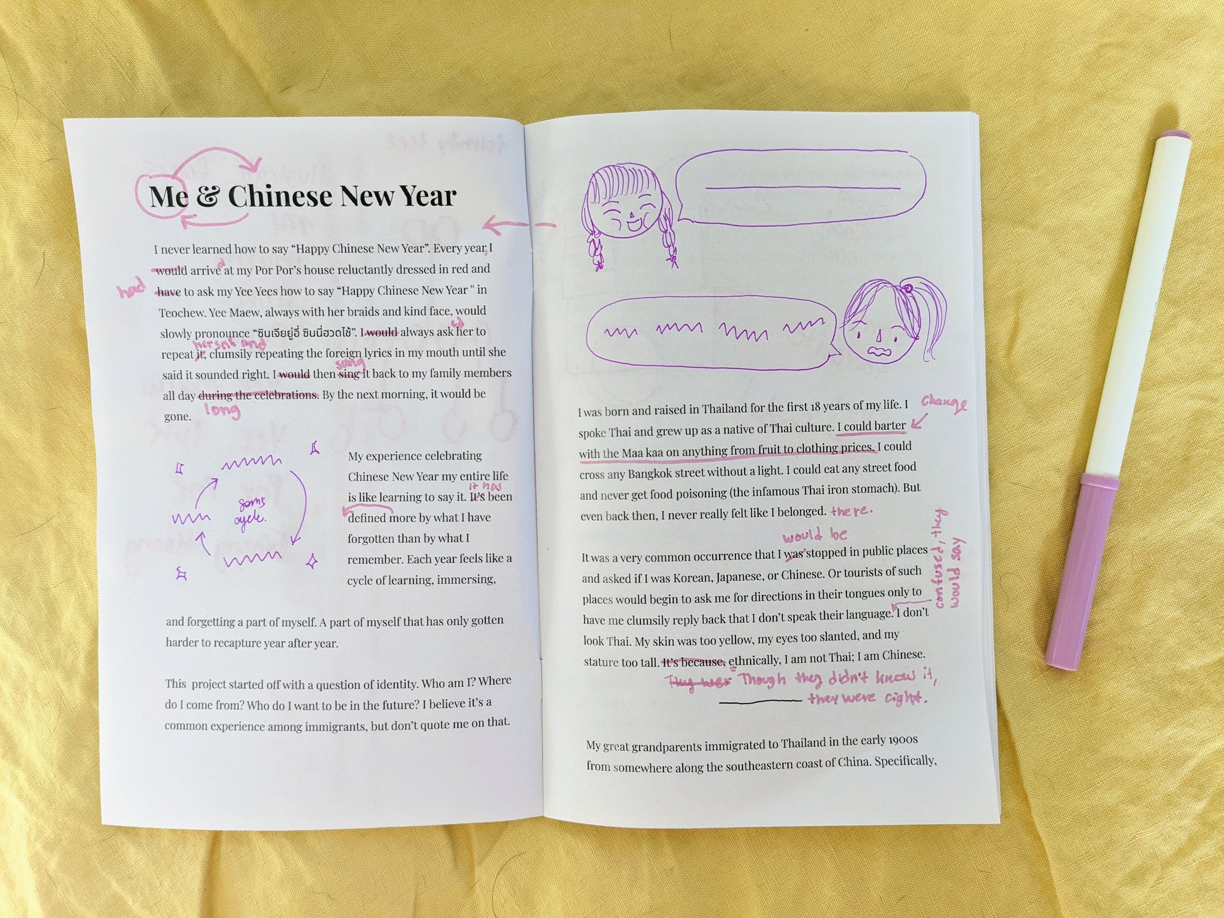
I finally got around to reviewing the content of what I wrote this week. I first gave it to another person to read through and asked them to make notes on the book as a whole. From there I asked their opinion of how they felt about reading through it. The feedback was really good. They started telling me about how the book made them reflect on their own experiences and cultural festivities even before I asked them if the book made them think of anything. That made me really happy as I hadn’t expected that even from the rough draft.
After they read through it, I would go through it a second time. I was more harsh and more nitpicky on the word choice, sentence structure, and grammar. I also used this opportunity to draw directly on the mockup with the storyboard of the illustration I wanted to create for it. This helped me to again get a clearer picture of what I wanted to draw and which ones that I wanted to cut out from my plan.

As I went through, I updated the illustration planner that I am using to keep track of all my zine illustrations. I found going through the storyboard on the printed mock-up more useful than I thought because it allowed me to think more about the size of the illustration and the overall flow of the story. I found that by going through it a second time, I cut out more abstract illustrations and stuck to more concrete ideas.
Started illustrated assets for my zine
With all that planning done and out of the way, I started illustration. Which I see will be my main hurdle for a long time. There were a lot of things that I needed to draw.