Local Alike Internship
May - August 2016 (Concept Delivered)
Responsive Web design, UI/UX Design, Visual Design, Data Analytics, User Research
Concept designs for a new search, trip, and dashboard pages for a social impact travel agency: live site ↗
Local Alike is a startup travel company in Thailand that offers community-based tours lead by locals. Their excursions not only give travelers experiences off the beaten path, but also contribute to the preservation of the environment, culture, and local way of life. The company is dedicated to helping local communities create new jobs, generate a second stream of revenue, and teach tourism skills.
“My thoughts and anecdotes will be in quotes and in blue“
Tools
Illustrator and Photoshop
HTML, CSS, Javascript
Google Analytics
Marvel
Skills
Experience design
Interface design
Visual design
Data analytics
User research
Mentor
Above: Concept design for the new search page
Impact and Contribution
Used my research, experience, and visual design skills to propose a new look for the website
During my tenure at LocalAlike, I conducted user research, analyzed web analytic data, created wireframes and prototypes, and collaborated with the production team to implement the designs into working front-end code.
The new search page was implemented during my time at the company and can be seen today. All other designs were developed after I left and can be seen today at localalike.com.
“Not only was I able to hone my skills as a UX designer, but I was also able to use my illustration skills to create pieces for the marketing department and was given the opportunity to travel around Thailand to facilitate tours in English. I have particularly fond memories of getting lost in a rice paddy. “
Above: (Left) Concept dashboard view for community tour organizers to create new offerings (Right) Concept dashboard home view for tour-goers
Problem space
How might we improve the overall web experience?
The website metrics were dropping and customer service was getting more phone calls and emails than normal. For my internship, I was asked to investigate its causes and propose solutions to them. I needed to determine why the service, and the value it provided, were a less than ideal fit for our target demographic.
“I was the only UX designer working at the company at the time of my internship. I worked with a graphic designer, the web developer, the marketing team, the touring team, and the C suite closely throughout my internship.”
Above: Short animation of the user flow from the search page to the booking page and then the dashboard
Users
Foreign Backpackers
These are travelers already in the country that wants an authentic experience of Thailand. They tend to be backpackers looking for a quick tour of a location that they are already staying in.

Photo source: Unsplash
Foreign Families
These are couples who tend to have young children. They are looking for fun and educational experiences to broaden their horizons. They are looking for tours that are all-inclusive and would provide convenient and safe experiences for their children.
Photo source: Natalya Zaritskaya via Unsplash
Corporations
As part of their annual volunteering services, these companies are looking towards us to organize tours with a focus on the biggest social impact they can make.
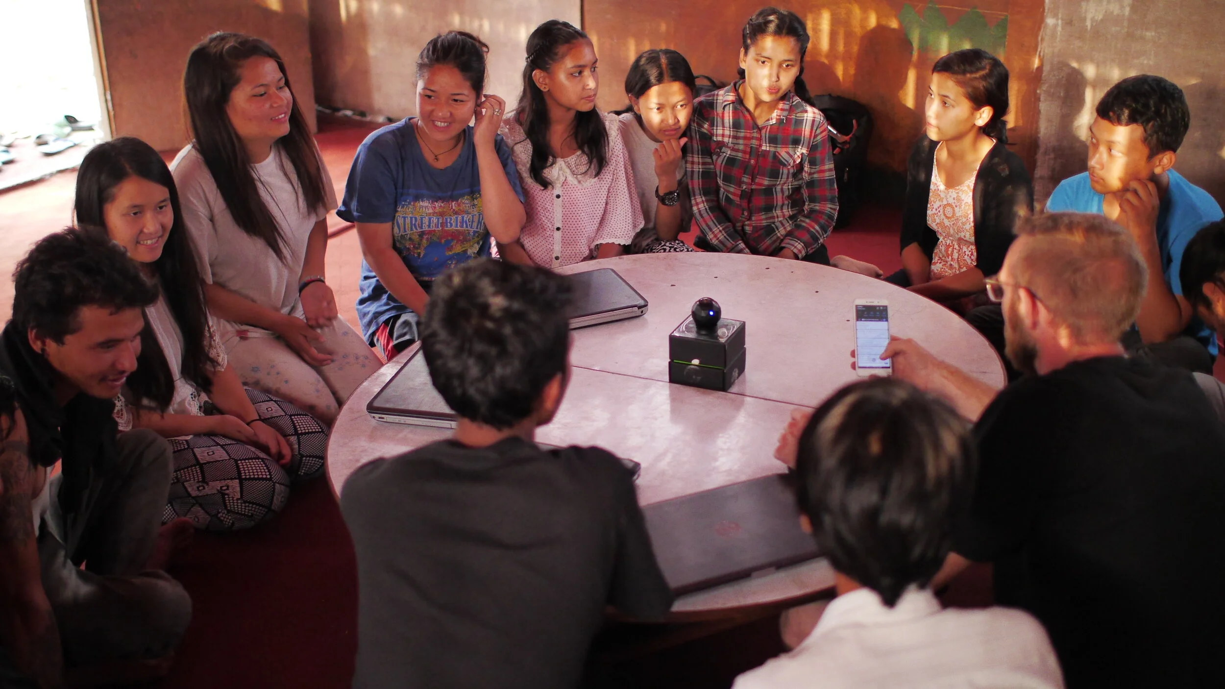
Photo source: Tribesh Kayastha via Unsplash
Above: (Left) Concept for new dashboard design (Right) Open filter options for the search page
Research
I interviewed what people’s perception of the company was and analyzed web metrics.
Interview Findings
The whole company was passionate about helping local communities preserve their traditions and environment through tourism.
The same attitude was reflected with the people that went on tours.
Web Metric Analysis
I posed the following questions to myself before I proceeded.
Why were users leaving the site so quickly?
How was the company perceived in the community?
Methods I used to answer these questions included user feedback surveys, blind testing with new users, and data analysis from our various datasets, such as Google Analytics, of user interaction on the website.
Web Metric Insights
Absence of feedback and unresponsiveness on different device led to a high bounce rate
A high number of users were mobile users; however, the website was not mobile-friendly
Young and unorganized appearance conveyed a negative perception of the company
Low usability of the dashboard leads to user frustration
Our value proposition was strong, but that is was being miscommunicated through deficiencies in branding and usability.
Above: Example information architectures I created for each concept page
Information Architecture
Easy navigation was a key factor in the redesign
I would start the brainstorming process by creating user journeys of different features. These user journeys were used to create an overview look of the web platform and guide production.
“These user journeys were used extensively throughout the design and development process. “
Above: Presentation of competitive analysis results to C-Suite
Competitive Analysis
What features do our competitors have?
I completed competitive analysis of our competitors and other search websites to find features that we might have missed or ones that our users would expect to be on the page. I presented my findings to the C-Suite to determine the design redirection. Once a direction was agreed on, it was used to create a feature prioritization list of what needed to be included for the MVP design.
Paper Prototypes
I started with sketching on paper. After each round of sketching, I conducted blind testing within the company on the drawings to gauge the usability of each screen.
Above: Video of the user flow from the search page to the booking page and then the dashboard
Digital & Interactive Prototype
I digitized these wireframes into into higher fidelity prototypes using Adobe Illustrator and Sketch. Deliverables in this stage included UI layouts, icons, and color scheme. This stage solidified the look and feel of the website, and entailed an iterative, reciprocal process of team management, development, and check-ins with the CEO.
After rounds of testing, I moved on and created an interactive prototype using Marvel.
“This interactive prototype was created using Marvel. If I could redo any part of my internship, I would have picked a different tool to create my prototype as I thought Marvel was a bit restrictive”
Final thoughts
Lessons I learned
Product and time management skills as I had to manage all aspects of my project during my internship.
Communications and presentation skills that helped me to better represent my own designs to various groups of people: developers, graphic designers, C suite, tour guides, and marketing people
Designs skills from creating a cross-platform application